Visual Identity for a Forward-Thinking Digital Agency
When WePixel came to me with their new venture, DigitalM8 (pronounced Digital Mate), they weren’t just looking for a logo. They were building something bigger: a full-service digital partner, the kind of agency that could handle strategy, design, development, and execution without the usual disconnects.
The problem? They didn’t yet look like that kind of partner.
In a crowded digital market, they needed an identity that instantly communicated trust, innovation, and collaboration—without feeling cold or generic. Their brand had to say: “We’re here to handle the whole journey, and we’ll do it with creativity and confidence.”
Finding the Voice of a “Mate”
I started by digging into the meaning of the name itself. Mate isn’t just a word. It’s a signal of reliability, of someone who’s on your side. That human quality was just as important as the “digital” part of their identity.
So instead of going for flashy or overly complex design, we built something that felt modern and sharp, but also approachable. A brand that could speak both to the boardroom and the startup garage.
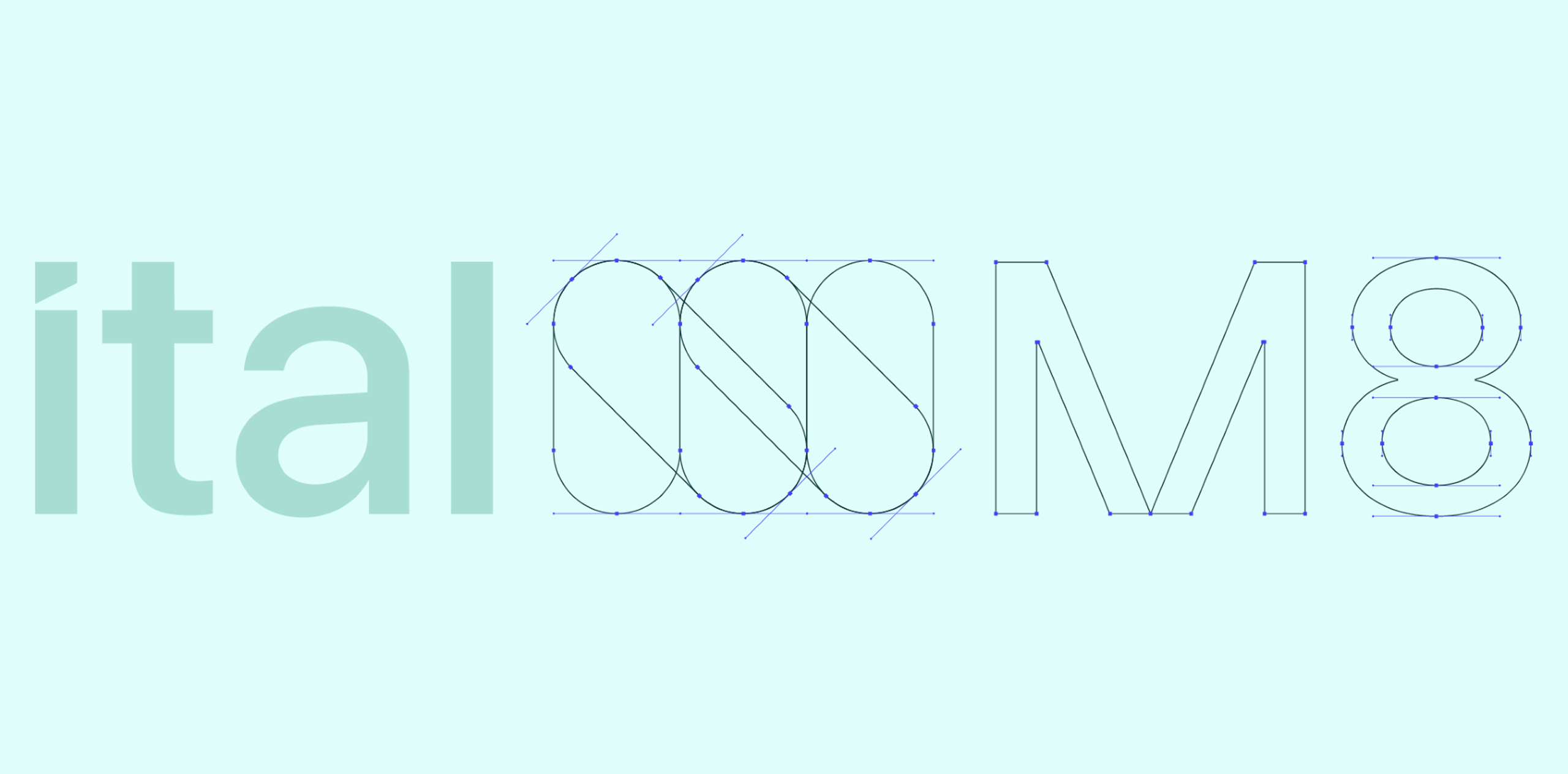
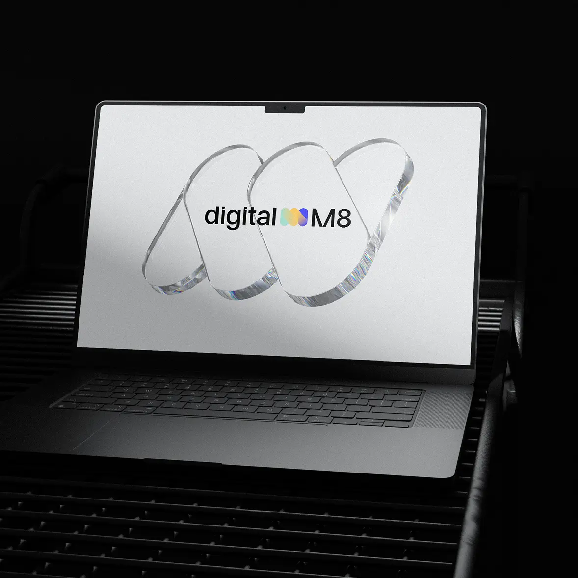
Crafting the Identity
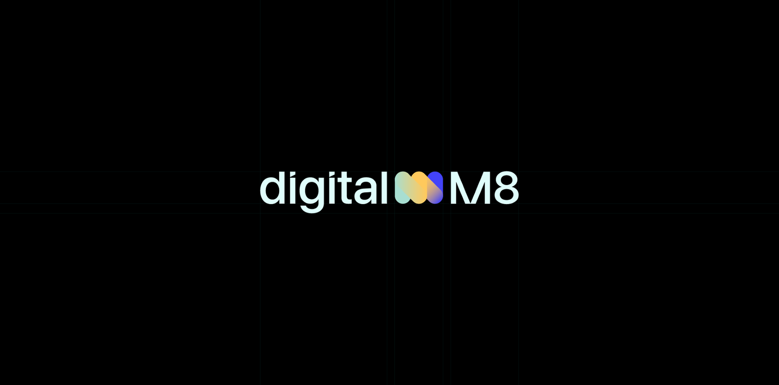
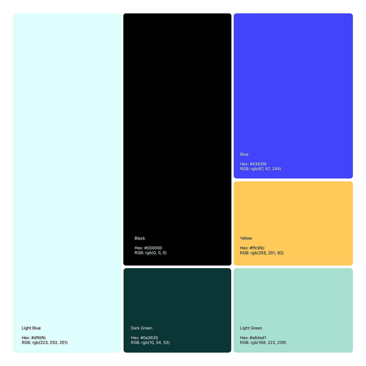
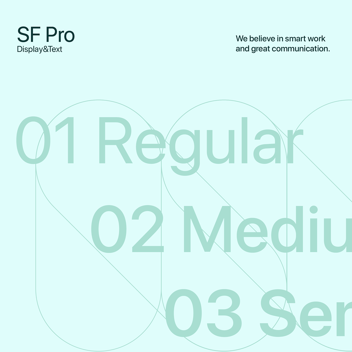
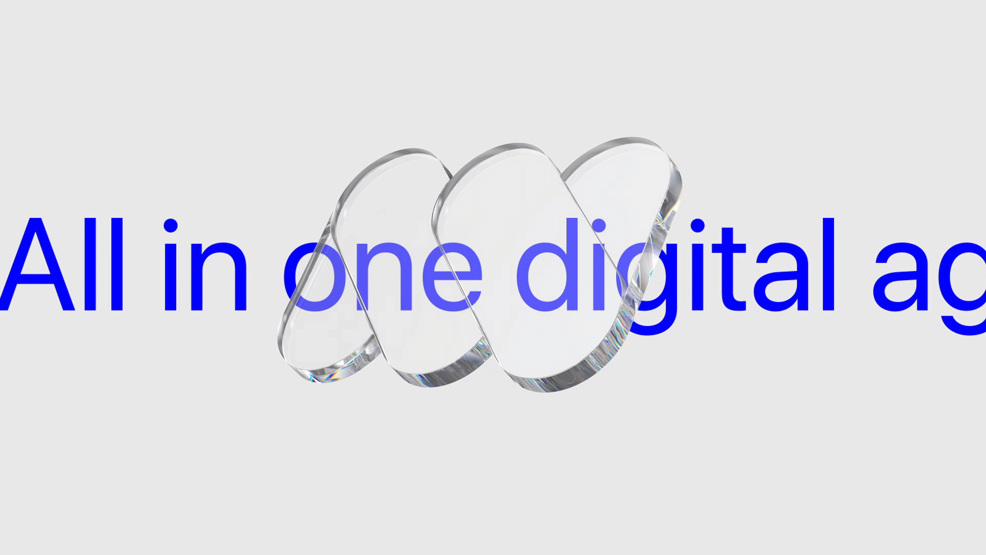
The logo became the anchor—clean, flexible, and strong enough to stand alone across platforms. The typography and color system were chosen to strike the right balance: professional but creative, bold but not overwhelming. Every detail was designed to support the story of DigitalM8 as a partner that brings clarity, consistency, and confidence to every project.
More Than a Logo
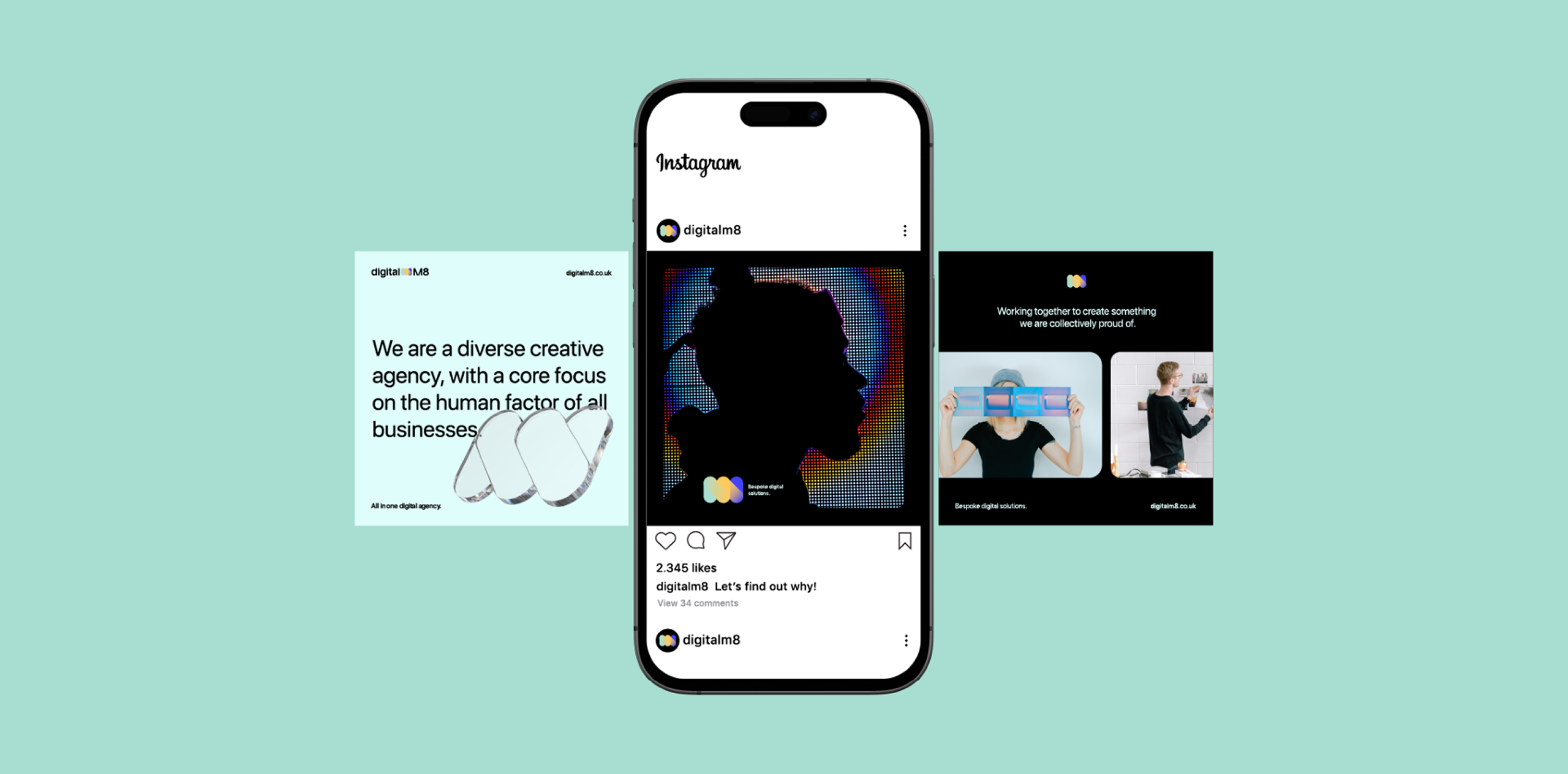
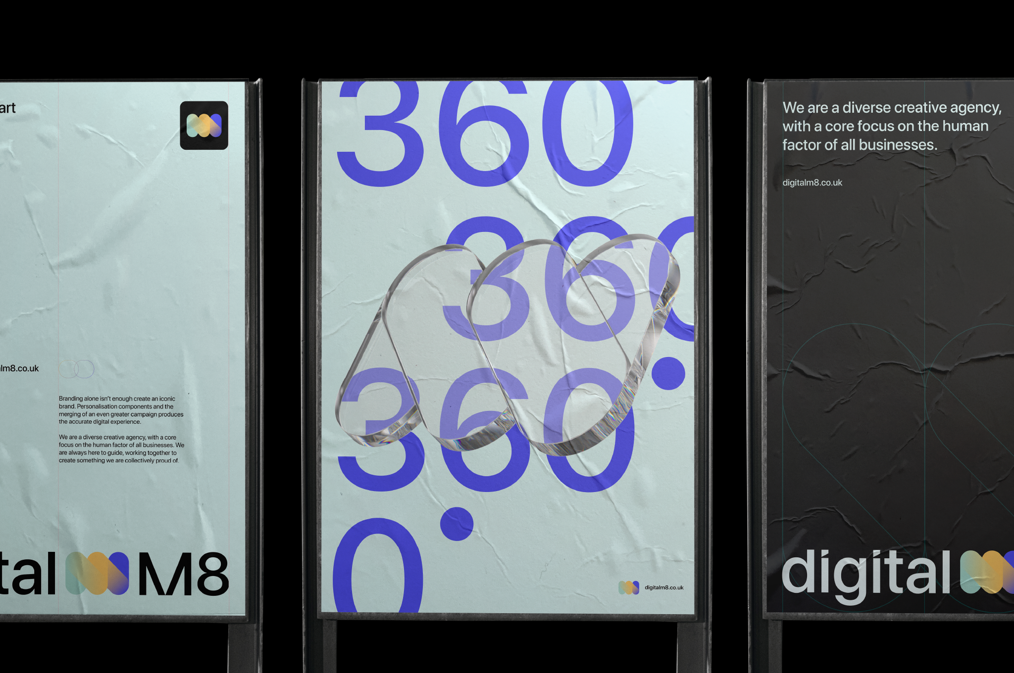
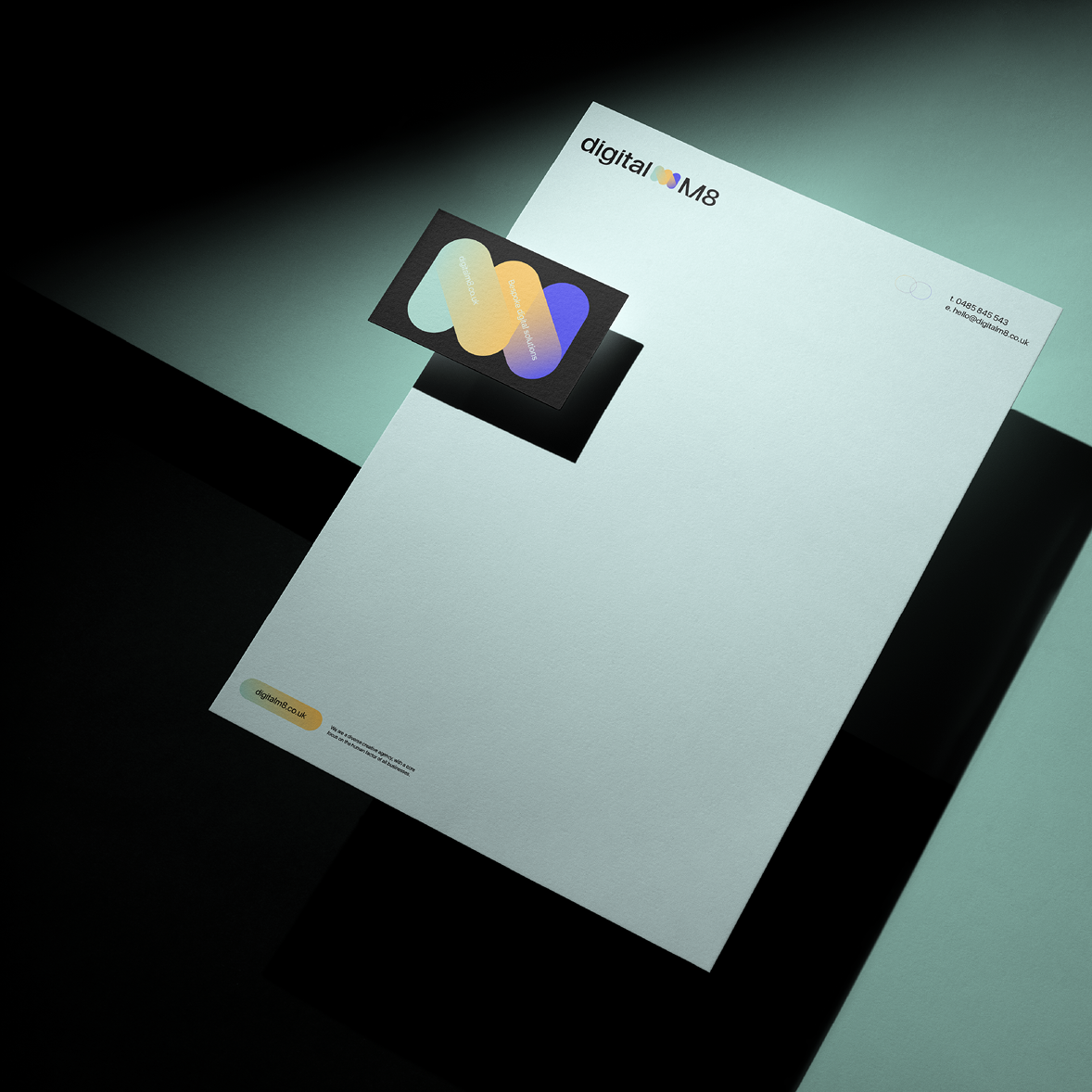
Once the core identity was established, we extended it across touchpoints. Presentation decks, digital mockups, and collateral all carried the same DNA, making sure the brand felt cohesive wherever it showed up.
The result was more than just a nice-looking visual system. It was a foundation. A toolkit DigitalM8 could use to communicate who they are and what they stand for—whether that’s in a pitch meeting, on a website, or in a client workshop.