Neen Dental.
Neen Dental is a fresh new player in the Romanian oral care space, built with the intention of changing how we experience something as simple as brushing our teeth. Instead of the usual clinical, sterile feel, Neen comes with a bold, tasteful approach and playful fruit flavors that make the whole routine feel lighter, more enjoyable, and a bit more human.
Challenge
The main challenge was to step away from the typical pharmaceutical look that dominates the category and create something that feels fresh, warm, and inviting.
At the same time, we had to find the right balance. The brand needed to feel playful and engaging, but without losing the sense of trust and credibility that people expect from dental care products.
Solution
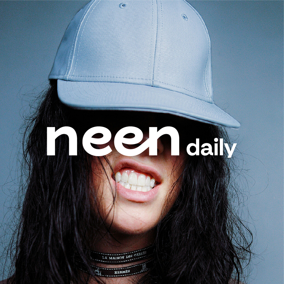
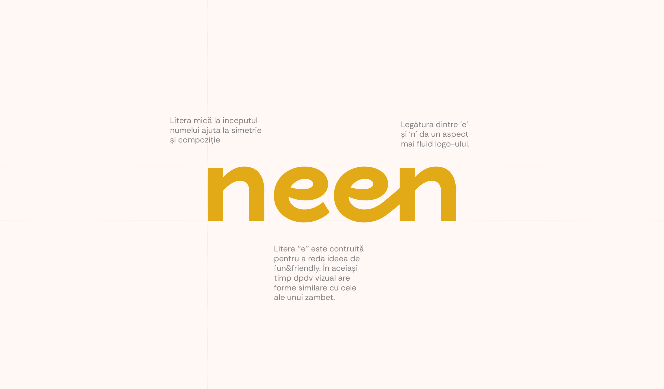
We built a visual identity that feels expressive and friendly, but still grounded and professional.
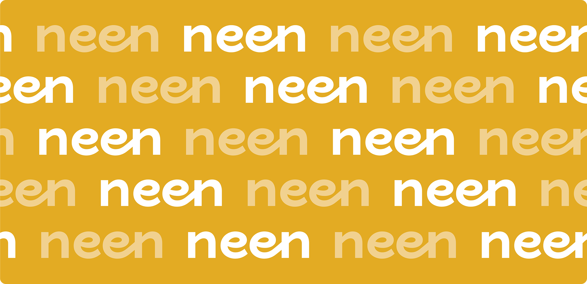
A bold logo and a vibrant color palette helped position Neen as something different from the first glance. We introduced fruit-inspired visuals to highlight the natural side of the products and to make the flavors more tangible and appealing. Strong colors became a key element, giving each product its own personality while reinforcing the idea of taste as a core differentiator.
This approach carried into the packaging, where we kept things playful but clean and well-structured, so it still feels trustworthy on the shelf.
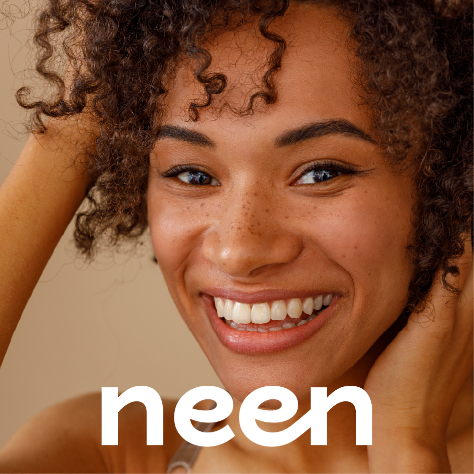
From there, we brought everything together through a dedicated photoshoot and a fully developed e-commerce website, creating a consistent experience across every touchpoint.
In collaboration with Subsign.